G&G Aviation
celebrates its 24th anniversary with a new company image
After the first 24 years
of successful operation, G&G Aviation has introduced a new company logo and
a renewed web site.
The new simple and clean graphic design of the logo reflects the evolution of the company which has progressively enlarged its field of activity from Italy and Europe, which were showing in the initial logo, to the entire world even thanks to the association with the Swiss broker Sparfell & Partners and the recent joining to the partnership Allianx.
The new simple and clean graphic design of the logo reflects the evolution of the company which has progressively enlarged its field of activity from Italy and Europe, which were showing in the initial logo, to the entire world even thanks to the association with the Swiss broker Sparfell & Partners and the recent joining to the partnership Allianx.
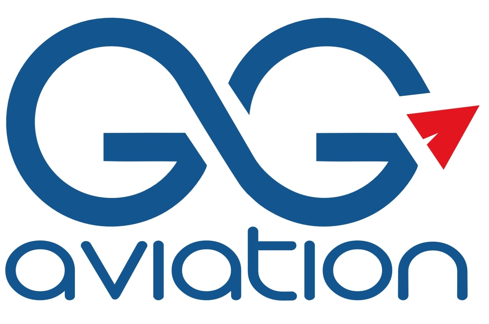
The continuous shape of
the two G, in the new logo, incorporates the & and also represent
the symbol of infinite to remind the countless solutions offered by G&G to
its customers. The red arrow reminds both the A of the company short acronyme
GGA and the easyest design of an aircraft while the upward orientation suggests
the growing trend.
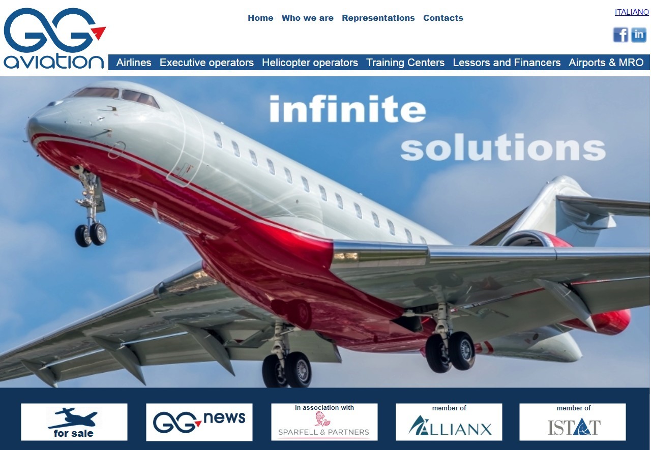
The company web site is
also undergoing a renovation which has started with a new header and
footer of all pages containing, in a clean configuration, all the links for an
easy navigation. The individual subpages dedicated to each product or service
will be further developed to better harmonize with the new overall
style.


The new logo will be
shown with the word aviation below or aside the main graphic depending on the
context.